TIORS - Traffic Incident Online Reporting System
TIORS offers a stress-free, accessible way to report traffic accidents in Canada, where drivers face a strict 24-hour deadline. By providing a multi-language, online reporting experience, the app helps drivers from diverse background navigate the process with clarity and ease—giving them the time and confidence to gather the right information and submit their reports without unnecessary pressure.
TIMELINE
8 Weeks Solo Project
MY ROLE
Experience Strategy, Visual Design, Branding, Interaction Design
DELIVERIABLES
UX Research, Experience Maps, User Flow, UX Wireframe, Interactive Prototype, Visual Design, and Usability Testing
Solution/demo
Key features that simplify and streamline the accident reporting process.
Seamless Accident Reporting
Report traffic accidents online with step-by-step guidance, reducing stress and confusion.
Multilingual Support
Submit reports in English, French, Chinese, or Korean, ensuring accessibility for diverse users.
Streamlined Insurance Integration
Easily share accident details with insurance companies, saving time and simplifying claims.
Clear & Accurate Instructions
Follow well-structured prompts and questions to ensure all essential details are recorded correctly.

The Challenge
The accident reporting process is often time-consuming, confusing, and inaccessible, especially for those facing language barriers, work constraints, or difficulties coordinating with other parties.
Insights
Conducted a survey with five drivers to gather feedback on key features.
To design an intuitive and accessible solution, I conducted user interviews and surveys with individuals who have firsthand experience with the process.
Check out the detailed findings.

Users appreciate the guided, step-by-step accident reporting feature, finding it clearer and less stressful thantraditional methods.
The photo-based reporting option makes it easier to document accidents, but some users worry about whether photos alone will be enough for an accurate report.
Multi-language support is a highly requested feature, especially for newcomers and non-English speakers, though users want assurance that translations are precise and contextually accurate.
While users like the seamless insurance integration, some are unsure if their insurance providers will support a fully digital process.
Solution Scoping
How might we make accident reporting faster and more accessible?
Through user research, I identified two major dimensions impacting the reporting experience: logistical challenges and psychological barriers.
1. Logistical Challenges
Based on user insights, these are the key external obstacles making reporting inconvenient:
Time Constraints – Many users, especially full-time workers, struggle to visit the collision center within 24 hours.
Language Barriers – Non-English speakers find police reports difficult to complete accurately.
Paperwork Complexity – Users are unsure what documents are needed, causing delays.
Lack of Digital Options – The requirement for in-person visits is inefficient and outdated.
🔎 How might we:
Reduce the time burden by enabling a fully digital accident reporting process?
Provide real-time guidance to help users gather necessary documents in advance?
Make reporting multilingual to eliminate language-related confusion?
2. Psychological Barriers
Reporting an accident is often overwhelming. Users describe feeling:
😕 Confused – “I didn’t know where to start or who to report to.”
😩 Frustrated – “I wasted hours trying to figure out the process.”
😓 Uncomfortable – “Talking to the other driver and sharing personal info felt unsafe.”
🔎 How might we:
Design a step-by-step, stress-free reporting flow that simplifies decision-making?
Reduce the need for direct contact between accident parties to ease tension?
Offer reassurance and transparency by clearly outlining next steps and expected timelines?
Personas
User personas: Connie and John

The Newcomer Driver
Profile
Name: Connie
Goal
Report accidents smoothly despite language barriers.
Struggles with English forms, unclear steps, and has no local support.
Quote
"I had no idea how to report my accident. A multilingual guide would have saved me so much stress."

The Busy Professional
Profile
Name: John
Goal
Report accidents quickly without disrupting work. Frustrated by in-person visits, unclear instructions, and wasted time.
Quote
"I wasted hours reporting my accident. An online option would be a game-changer."
User Journey Map
Illustrates the complete accident reporting process
This user journey map covers five stages of accident reporting, highlighting user actions, emotions, and pain points, with peak stress during initial response and reporting.
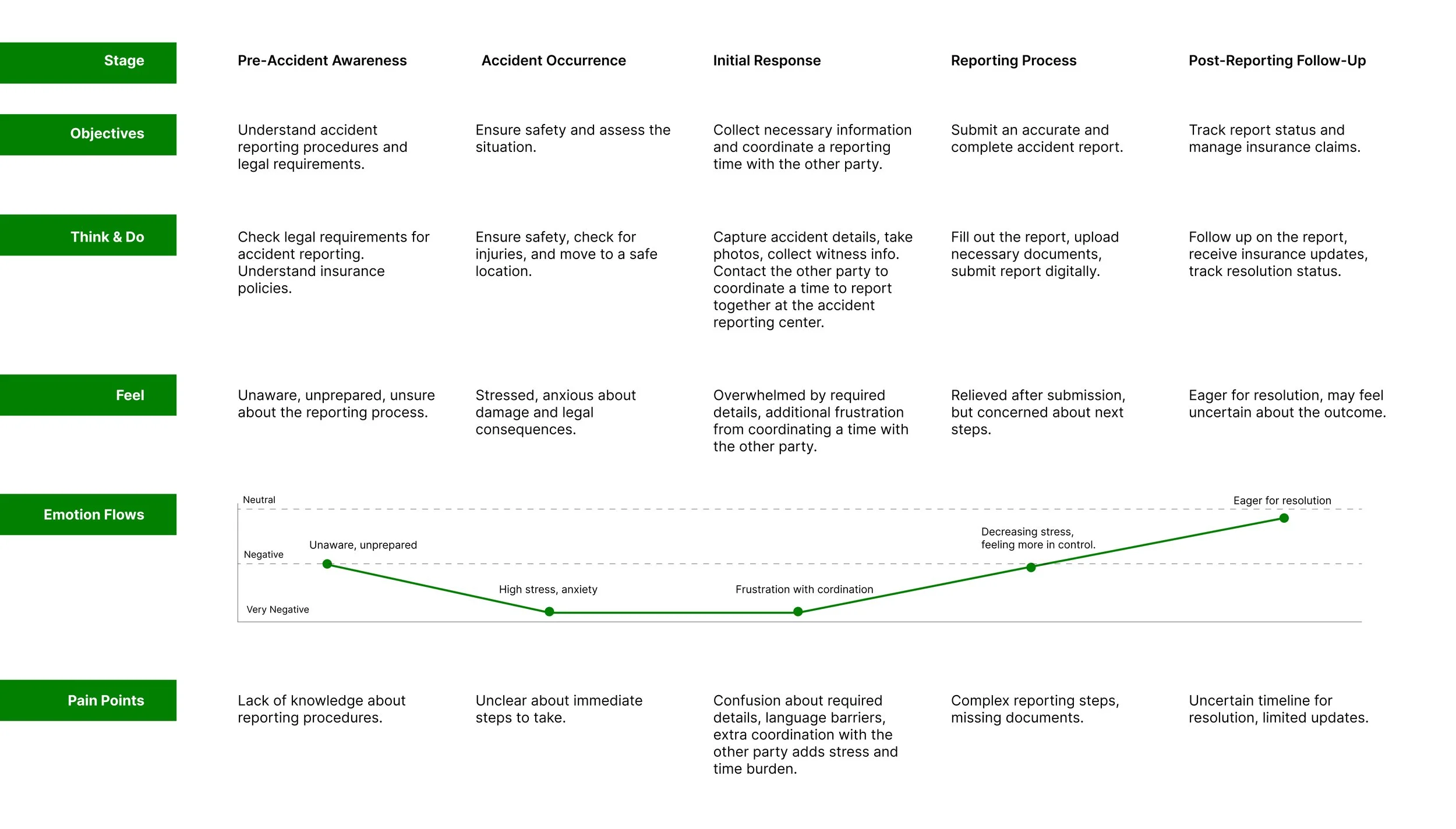
Key Pain Points
The accident reporting process is often time-consuming, confusing, and inaccessible, especially for those facing language barriers, work constraints, or difficulties coordinating with other parties.
🙆 User Needs
A faster, more efficient way to report traffic incidents.
A clear and guided process to reduce confusion and stress.
A seamless connection between accident reporting and insurance claims.
A convenient, multilingual option for those struggling with language barriers.
💭 Design Principles
Provide step-by-step guidance to make reporting intuitive.
Ensure accessible, multi-language support for diverse users.
Enable digital reporting to reduce in-person visits and save time.
Offer a secure and structured way to share information between involved parties.
🔵 Key Challenges
Streamlining the accident reporting process to make it more intuitive.
Minimizing the time and effort required for users to complete reports.
Enhancing the connection between accident reporting and insurance claims.
Ensuring accessibility for non-English speakers through multilingual support.
Inspo analysis
How to simplify and improve the accident reporting experience?
📷 Photo-Based Reporting
✅ Allows users to upload accident photos instead of manually describing details.
⛔️ Accuracy depends on users capturing clear and relevant images.

🌍 Multi-Language Support
✅ Helps newcomers and non-English speakers navigate reporting with ease.
⛔️ Requires precise translation to avoid misinterpretation.

📢 Smart Guidance & Reminders
✅ Provides step-by-step instructions and alerts users about missing documents.
⛔️ Users may still need additional support for complex cases.

Design Concepts
Design Concepts

Wire flow
Based on user research, I created wireframes for core interfaces, testing usability and navigation clarity.
Create Account Flow

Traffic incideng report flow

Step-by-Step Guidance
Streamlines accident reporting with a structured, intuitive flow to reduce confusion and ensure accurate submissions.
✅ Progress indicators keep users on track.
✅ Flexible input allows edits before submission.
✅ Automated insurance linking saves time.
Users choose the accident type (standard, hit-and-run, or other) for a tailored reporting process.
1. Incident Selection
A checklist-style tracker breaks the report into key sections (location, damage, passengers, witnesses), with a 24-hour countdown for submission.
2. Guided Data Entry
3. Insurance Integration
Users enter policy details with validation, ensuring seamless claim processing.

Photo-Based Reporting
Simplifies accident documentation with a photo-based reporting feature, allowing users to visually capture vehicle damage instead of relying on lengthy text descriptions.
✅ Faster & more accurate accident reporting.
✅ Reduces stress by simplifying documentation.
✅ Ensures clarity for insurance claims and legal reporting.
1. Capture & Upload Evidence
Users can take photos instantly via the in-app camera or upload existing images. Multiple photos provide a clear, detailed record of the damage.
2. Optional Description for Additional Context
Users can add written notes to explain specific damage details if needed. Keeps the process flexible without requiring excessive manual input.
3. Auto-Save & Confirmation
A pop-up confirmation ensures that uploaded data is securely saved. Users can review and continue without worrying about lost information.

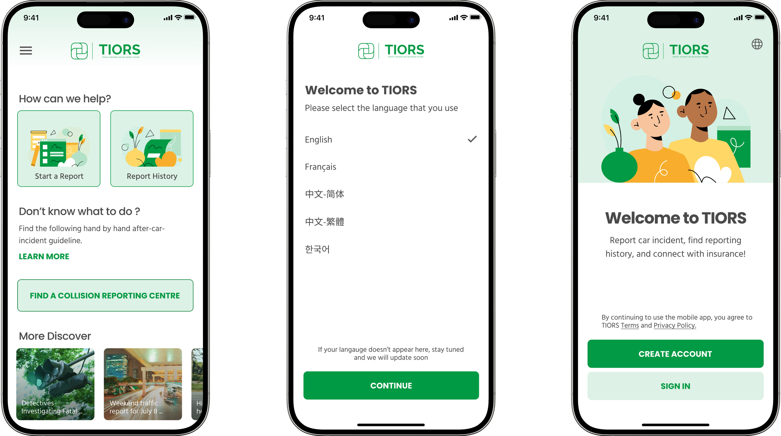
Report Navigation & Language Selection
Provides an accessible, user-friendly accident reporting experience with clear navigation and multilingual support.
✅ Guided, hassle-free navigation for first-time users.
✅ Multi-language support reduces barriers for non-English speakers.
✅ Seamless access to resources for accident-related guidance.
1. Intuitive Report Navigation
Users can start a new report or access report history directly from the home screen. A "Find a Collision Reporting Centre" button helps locate nearby reporting stations. Additional resources, including guidelines and news updates, enhance user awareness.
2. Multilingual Support
Users select their preferred language at onboarding, ensuring accessibility. Supports English, French, Simplified Chinese, Traditional Chinese, and Korean. A "more languages coming soon" message reassures users of future improvements.
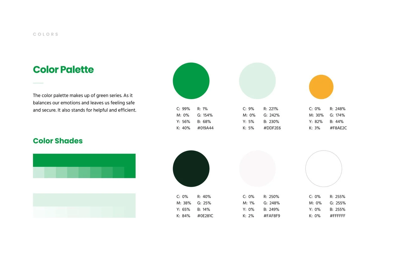
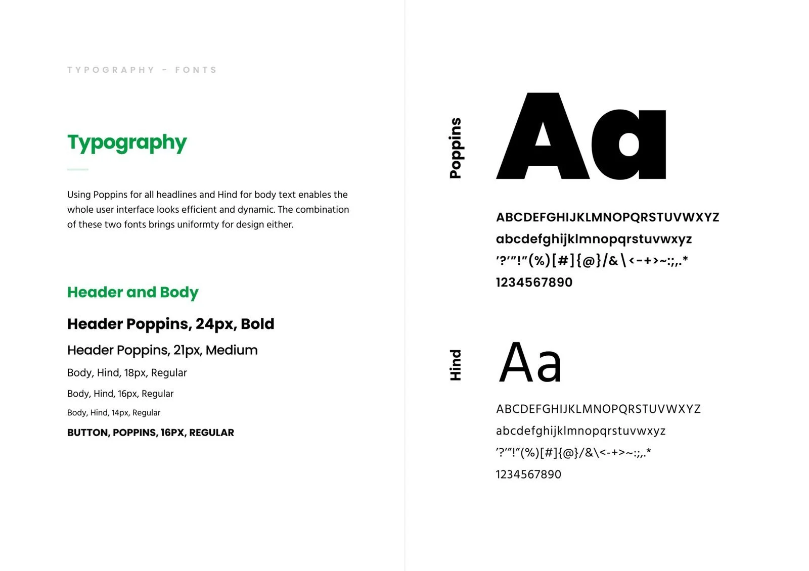
Design Systems
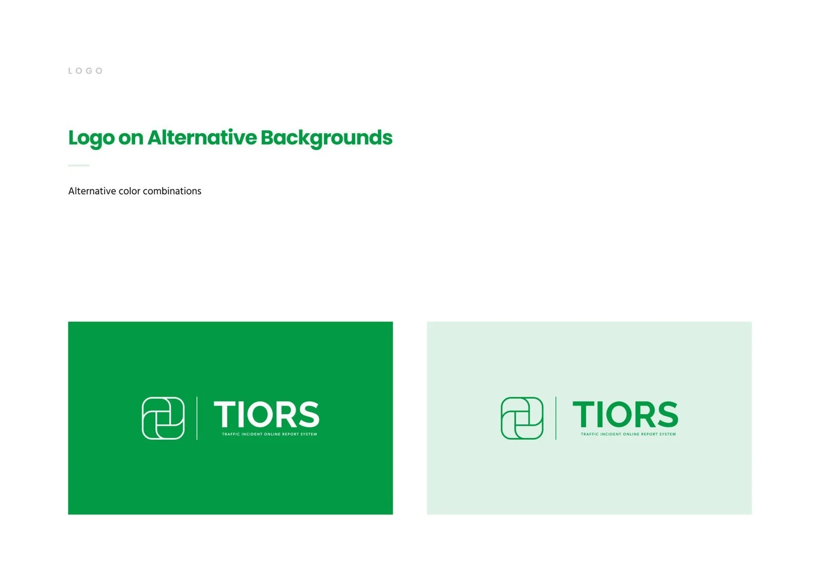
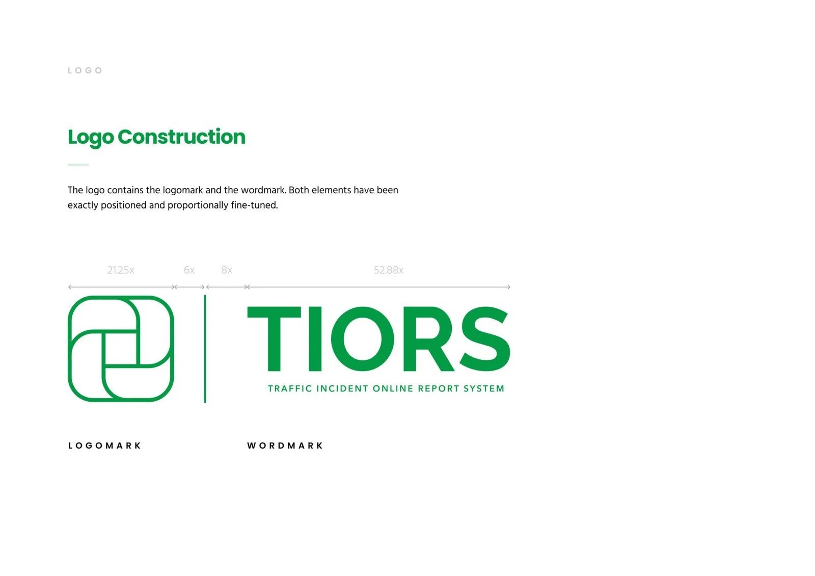
I chose green as the main color for its calming effect, promoting safety and security. The logo's four rectangles represent the government, insurance company, third party, and users, with the center square uniting them—symbolizing TIORS' spirit.
The brand is defined by five key attributes: secure, helpful, simple, professional, and revolutionary. Security is essential due to the involvement of police and insurance. The product is designed to be helpful, simple, and professional, making it user-friendly. As more people shift to online reporting, being revolutionary is crucial.
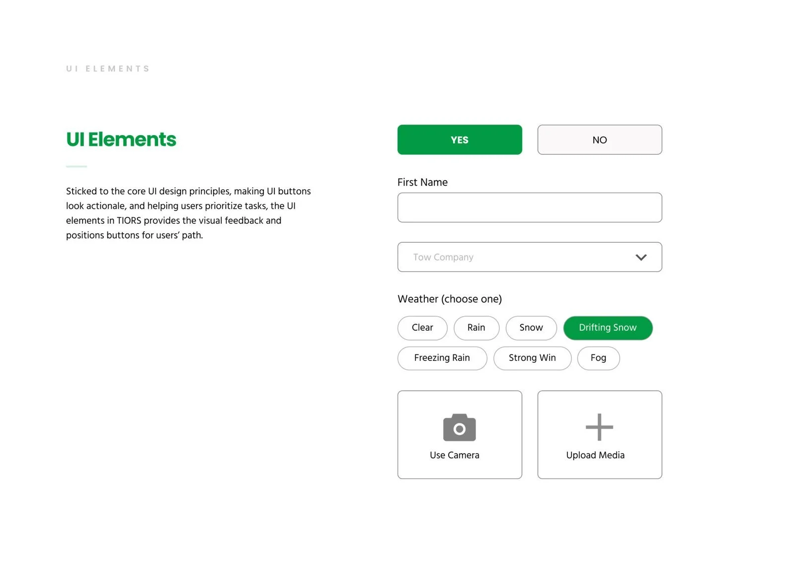
Design Components & Brand Platforms

Future steps
Enhance Guidance for First-Time Users
1.
📌 Issue: While the app provides structured steps, first-time users may still feel uncertain about what to do next.
✅ Improvement: Add an interactive walkthrough or tooltips for key steps (e.g., photo upload, insurance entry).
Expand Multilingual Support & Translation Clarity
2.
📌 Issue: While the app supports multiple languages, legal or insurance terms might still be difficult for non-native speakers.
✅ Improvement: Implement simplified explanations or in-app translation assistance for complex reporting terms.
Improve Photo Documentation Workflow
3.
📌 Issue: Users must manually upload multiple images, which could be time-consuming.
✅ Improvement: Enable automatic photo suggestions based on damage detection (e.g., “Capture front, side, and rear views”).
Integrate Real-Time Support
4.
📌 Issue: Users might need immediate assistance while filling out their report.
✅ Improvement: Introduce AI chatbot assistance or live chat with support agents to answer common questions instantly.
Next Project

Bike Time was to enhance an eCommerce website browsing and checkout experience to greatly improve their product’s usability.
Bike Time
〰️
Bike Time 〰️