Bike Time - Ecommerce Design Challenge
Bike Time is an e-commerce website that helps serious bikers discover, compare, and purchase their perfect bikes with confidence.
How might we improve the product browsing and checkout experience to help picky users find the best-fit bike faster and complete their purchases more easily?
I redesigned the browsing flow and checkout process for Bike Time’s e-commerce website in a 2-week solo project to reduce drop-offs and boost conversion rates.
TIMELINE
2 Weeks Solo Project
MY ROLE
Solution, Low-Fidelity Flows, Prototypes, Product Mockups, High-Fidelity Flows
DELIVERIABLES
User Interface Designer. User Experience Researcher. Experience Strategy Specialist. Problem Solver.
Challenge Scope
So how might we improve the browsing and checkout experience of Bike Time to increase the conversion rate and reduce user drop-offs?
Bike Time is a premium e-commerce website that specializes in selling high-end bikes. Since purchasing a bike is a relatively expensive decision, users need clear product information and reliable service policies to feel comfortable

Industry Insights
Exploring how reducing financial and product risks boosts online shopping confidence.
Secondary Research
To better understand the common barriers in the online shopping journey, I conducted secondary research on user behavior in e-commerce. According to Jephuneh.E (2012), both financial risk (fear of losing money) and product risk (uncertainty about product quality) have negative effects on consumers’ online shopping attitudes.
Research Findings
I found that providing clear information about delivery timeframes and return policies can effectively reduce users' anxiety and increase their willingness to purchase.
Competitive Research
To explore potential design solutions, I conducted a competitive analysis on three leading bike e-commerce websites.
Findings show that integrating ratings, reviews, and comparison tools has become a common UX pattern in the bike e-commerce industry for improving conversion rates.

User Interviews
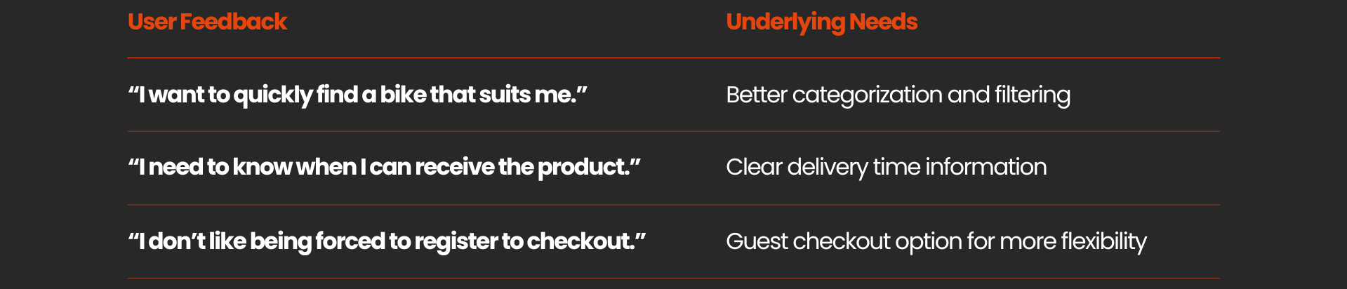
I interviewed several target consumers who had experience purchasing bicycles online to better understand their needs, pain points, and motivations. Here are some key takeaways:
User Journey Pain Points
Based on the research, I mapped the user flow and pinpointed key pain points.
Users face two main barriers: unclear product details lead to decision paralysis, and forced account registration prevents seamless checkout.
#1
Browsing Products → Unable to Decide → Drop-off
Lack of clear product information
No product ratings, reviews, or comparison features
#2
Add to Cart → Forced Account Registration → Drop-off
No guest checkout option available
Concern about receiving marketing emails
Analysis
Design Principles to Follow:
· Clarity over complexity
Ensure key product specs and prices are immediately visible.
· Progressive disclosure
Present information in steps to ease cognitive load.
· Guest checkout
Eliminate all barriers between product selection and final purchase.
Ideation
I started my ideation with a breakdown of users’ potential scenarios when shopping for bikes online.
1. Product Comparison Confusion 🛒
"I want to compare several bikes side by side and instantly spot which one fits me best."
2. Decision Fatigue 🧠
"There are too many similar models and unclear specs. I want to make decisions faster."
3. Low Emotional Engagement ❤️
"I want to feel like I’m actually riding the bike — real lifestyle images would help me connect."
4. Checkout Drop-off 🔁
"I don’t want to create an account. I just want a few easy steps to complete my purchase."
5. Right-handed Usability 🖐️
"I’m right-handed, so I prefer interactive buttons and confirmations placed on the right side for easier access."
HMW
How can we make product comparison easy and clear?
How can we simplify checkout without confusion?
How can we design interactions that feel natural?
How can we connect emotionally through visuals?
Persona
Alex and Emily highlight key challenges in online bike shopping

Alex Miller
Age
34
Needs
Wants to confidently purchase a high-performance bike online without any obstacles.
Habits
Prefers shopping on desktop websites and using a wide screen for easier side-by-side product comparisons.
Frustrations
Dislikes re-entering information or being forced to register an account; often feels lost when comparing similar products.

Emily Harper
Age
31
Needs
Wants to quickly find a bike suitable for city commuting and weekend rides, with a clear understanding of feature and price differences.
Habits
Navigates websites using clear product categories and filter options, and relies on the "Top Sales" and "Best Ratings" sections to quickly identify popular choices.
Frustrations
Not tech-savvy—easily overwhelmed by complex product specifications; dislikes having to register an account to place an order.
User Flows
This structure helps to clearly visualize user behavior from product discovery to successful checkout, ensuring a smooth shopping experience.


Wireframing
I explored and developed wireframes to visualize and test ideas.
Homepage
Hero Banner: Highlights promotions to grab attention instantly
Category Preview: Horizontal layout for easy product category navigation
Product Highlights: Displays bestsellers with ratings to build trust
Testimonials: Adds credibility through user voices
Service Highlights: Reinforces value props like free delivery and secure payment
Footer Links: Offers secondary navigation for full-site access

Category Page
Filter & Sorting Bar: Lets users refine and control results display
Grid Layout: Maximizes visual product comparison across rows
Ratings & Pricing Preview: Helps users quickly assess value
Pagination: Encourages continued browsing without overload
Persistent Service Benefits: Reassures users with visible value propositions at the bottom

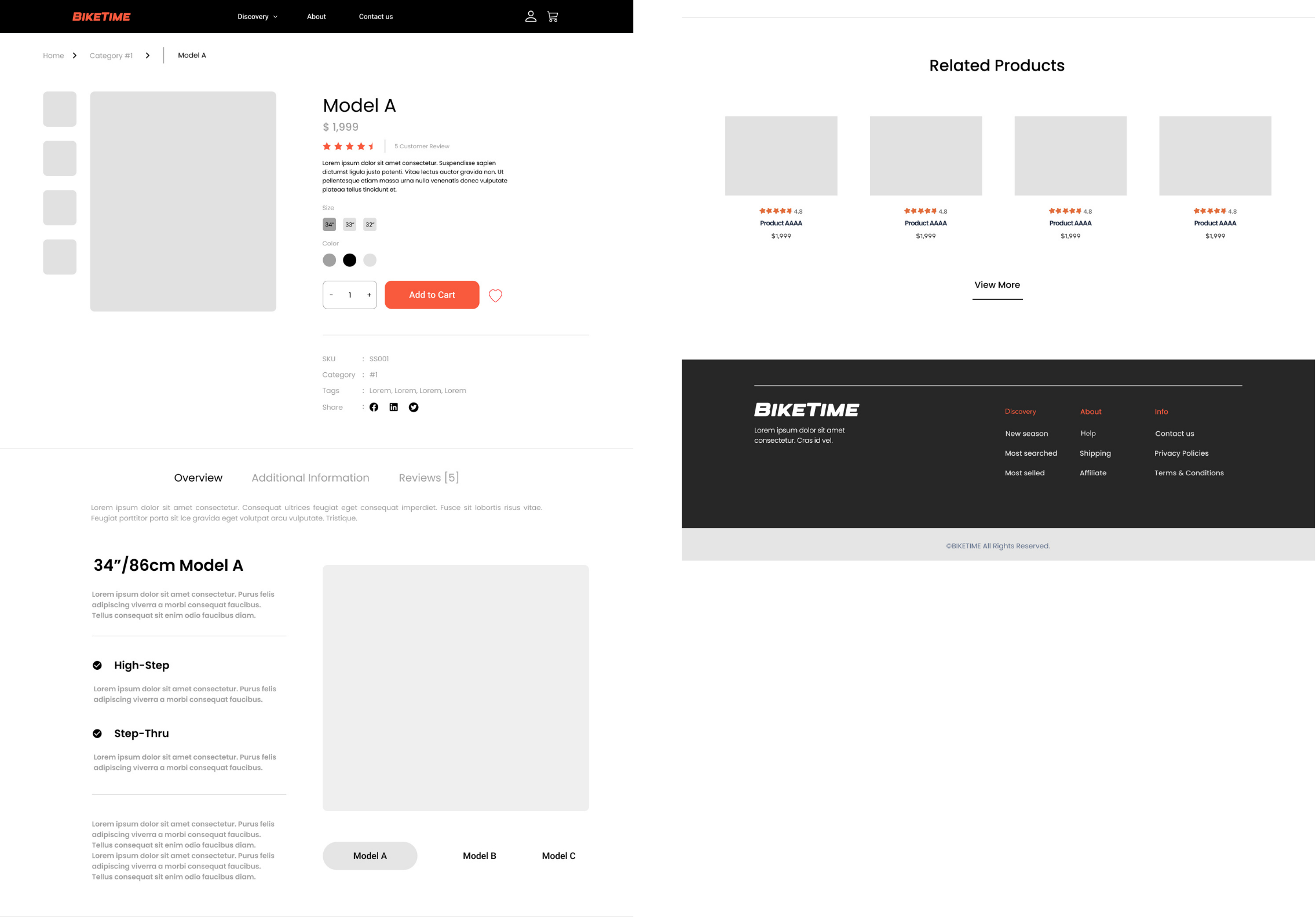
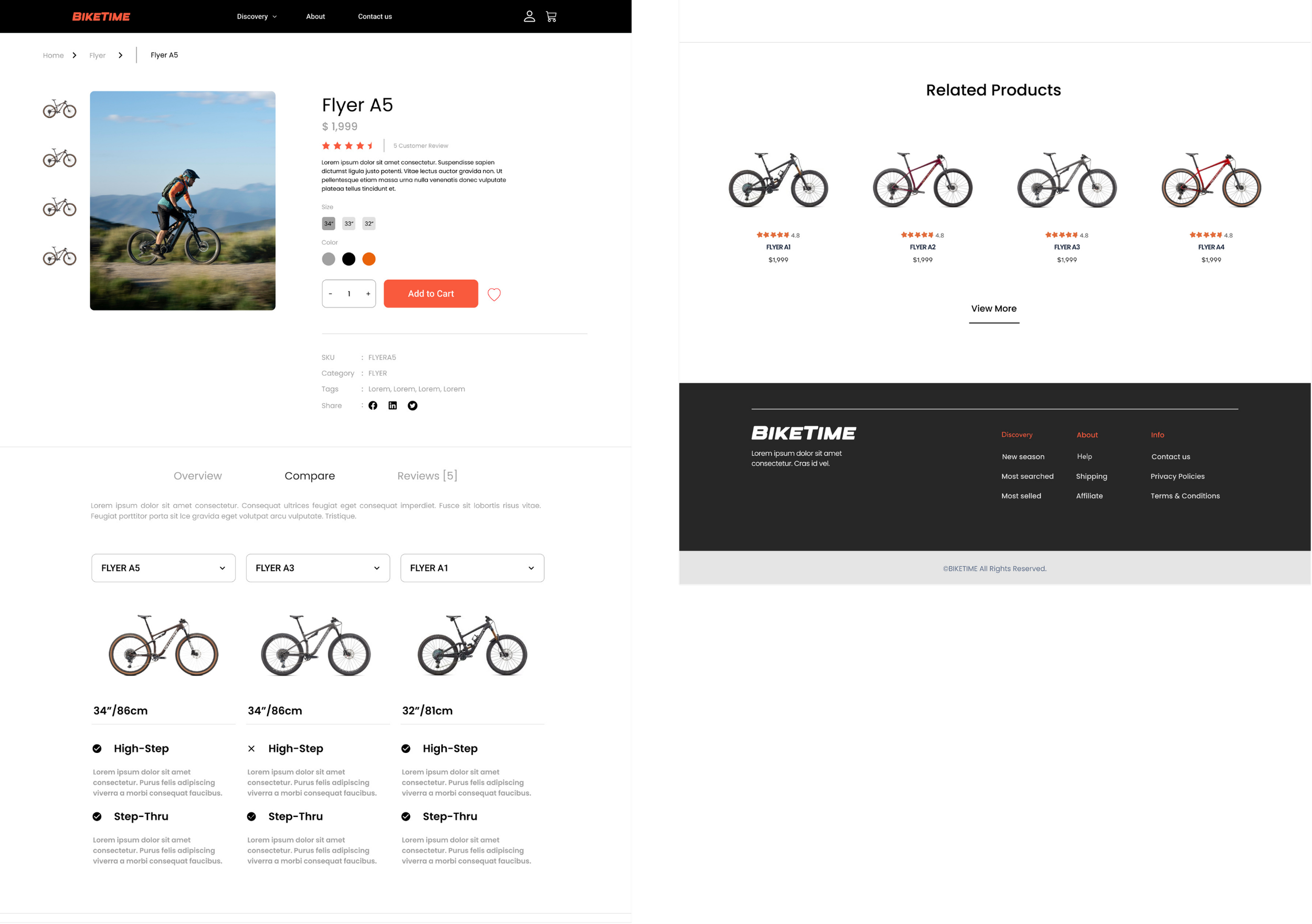
Product Page
Gallery Sidebar: Vertical image thumbnails for quick viewing
Core Info Panel: Highlights price, rating, color/size options, and “Add to Cart” CTA
Comparison Section: Enables users to evaluate models side-by-side
Feature Breakdown: Clear technical spec layout (High-Step, Step-Thru)
Related Products: Encourages further exploration and cross-selling
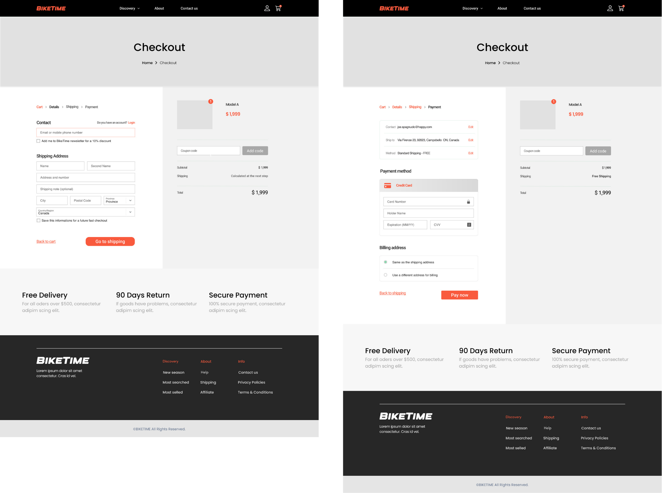
Checkout Page
Step 1: Contact & Shipping – Minimal fields, optional newsletter, autofill support
Step 2: Shipping Method – Defaults to free, easy confirmation
Step 3: Payment – Secure card entry, billing autofill
This structured breakdown helps streamline the purchasing process, aiming to reduce drop-offs and boost completion rates.
Testing & Analysis
I tested the design with 3 bike enthusiasts in 30-minute sessions.
To validate the design, I conducted a low-fidelity usability test with 3 users (2 male, 1 female), all of whom are bike enthusiasts with an average annual income of $100,000. Each session lasted approximately 30 minutes.
Synthesis
By combining user testing insights with my design rationale, I optimized Bike Time’s information architecture as follows.
Product Discovery → Quick scanning through “Top Sales” or “All Bikes”
Product Page → Mandatory option selection (size, color) before checkout
Checkout Flow → Clear, step-by-step process
Layout Optimization → Logical information hierarchy across all pages
User Comfort → Reduced hesitation by confirming product details upfront
Design
After finalizing the structure, I built a story-driven Hi-Fi prototype to walk through key UX moments from product discovery to purchase.
Let’s Meet the Riders:
Emily, a first-time rider, and Alex, her cyclist partner.
Emily has never purchased a bike online before and feels overwhelmed by too many choices. Alex, on the other hand, has high standards and wants to help Emily make a smart, stylish decision. Their goal? Find a bike that’s easy to ride and visually appealing—for under $2,000.

Story
Landing on the Homepage
🧠 Design Thought: Help Emily scan quickly and feel welcomed with a clear value proposition.
Emily scrolls through the homepage. The bold "Save $500 on 2 Bikes" banner catches her eye—clear, bold messaging that addresses both budget and excitement. She clicks “Discover our collection” to start.

Emily
“That looks promising—and I love the visual style.”
Browsing the Category Page
🧠 Design Thought: Reduce choice paralysis. Organize layout by familiarity and filterability.
Emily and Alex land on the FLYER category page, where they immediately notice clean grids, quick star ratings, and visible prices. Alex helps Emily use the Filter and Sort by Rating—they land on "Flyer A5."

Alex
“Let’s check this one out—it’s got great reviews and matches your size.”
Exploring the Product Page
🧠 Design Thought: Minimize hesitation with clear product visuals, size options, and mandatory selections.
Emily loves the lifestyle imagery and easily selects her color and size (34”). She feels confident clicking "Add to Cart" because she must pick both size and color first—removing future doubts.
Emily
“That was simple—and I’m sure I picked the right size now.”
Comparing Bikes (Product Page)
🧠 Design Thought: Give Alex the tools to help Emily decide faster.
Alex suggests using the built-in Compare function to see Flyer A5 vs A3 vs A1. They quickly see the differences in wheel height and riding style.
Alex
“A5 has both Step-Thru and High-Step—it’s more versatile for you.”
Emily
“Okay let’s stick with it!”
Review & Checkout
🧠 Design Thought: Break the checkout flow into progressive steps to reduce cognitive load.
Cart: Emily reviews the Flyer A5 is still the right choice.
Shipping Info: She fills in her address with visual clarity.
Payment Method: Clear payment layout with the total price shown early.
Confirmation Page: Instant reassurance with a success message and shipping info.

Emily
“Wow, that checkout was smooth—I didn’t even get confused once.”
Success & Joy
🧠 Design Thought: End with a positive emotional anchor—users remember the last step most.
Emily sees her order summary, delivery time, and gets a warm “Payment Confirmed” checkmark. She clicks Print Receipt and says:

Emily
“Done! Can’t wait to ride with you, Alex.”
Alex
“Told you Bike Time’s site was good.”
Design
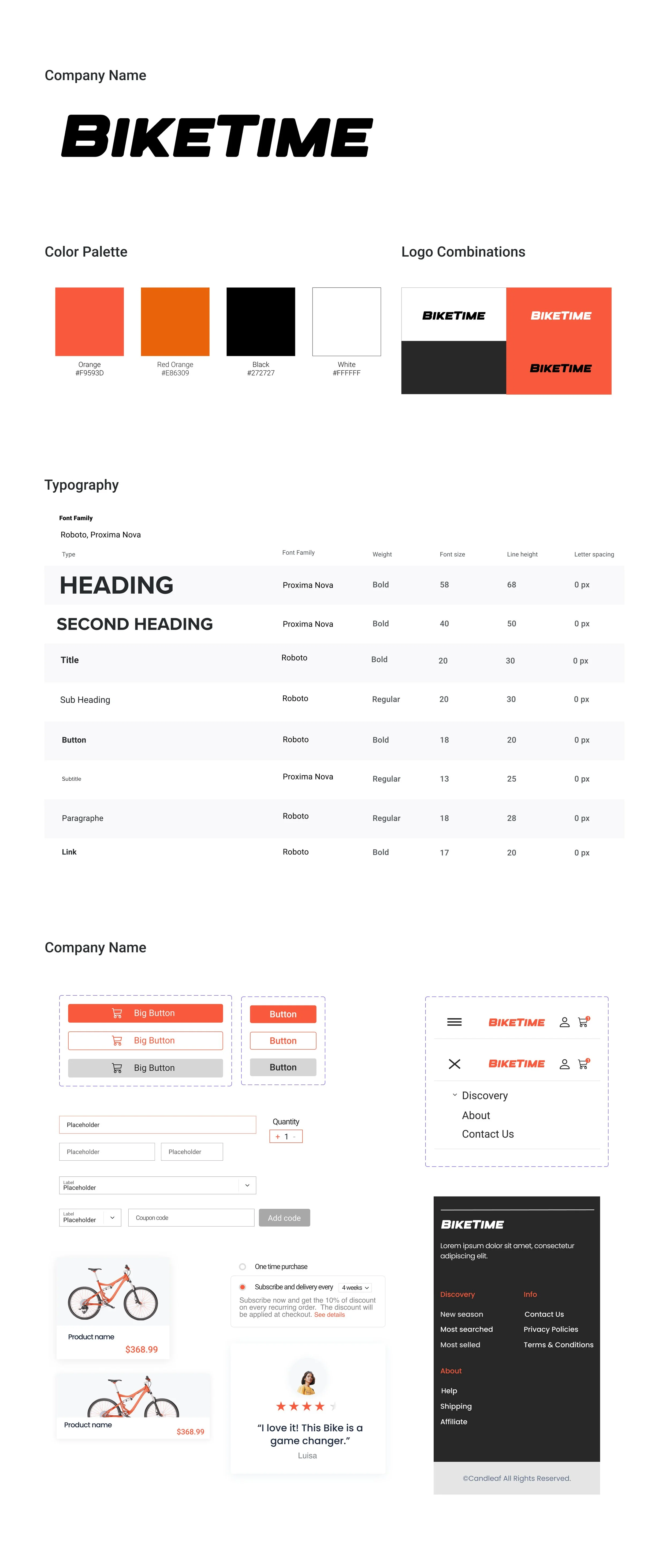
To reflect Bike Time’s energetic and confident brand, I built a bold and functional visual system optimized for desktop shopping.
This clean, structured system supports focused decision-making—especially for users like Emily and Alex who value simplicity and side-by-side clarity.
Future Steps
This project was completed within a short timeframe, so there are still several opportunities for refinement if given more time.
More product & competitor research
While designing, I made several assumptions about user needs and market expectations. With more time, I would like to dive deeper into real-world competitor flows and shopping habits to validate my design decisions.
More usability testing & iteration
Due to limited time, I only conducted 3 rounds of low-fidelity testing. I’d love to run more usability tests—especially with non-tech-savvy users like Emily—to improve the decision-making flow and optimize comparison UX.
Responsive design & multi-device coverage
This version was optimized for desktop users like Alex, who prefer wide-screen browsing. If extended, I’d adapt the experience for mobile and tablet users to ensure a consistent experience across devices.
Features like guest checkout and size/color enforcement worked well in testing, but I’d like to simulate more edge cases (e.g. cart abandonment, coupon errors) to refine micro-interactions and prevent drop-offs.
Refine edge-case interactions
Next Project
The PostUp mobile app was developed through a 5-day Design Sprint, aiming to help remote workers quickly find suitable public places for work.
Post Up
〰️
Post Up 〰️