Post Up - Find the Best Work-Friendly Public Spaces
I redesigned the PostUp mobile app in a 5-day solo design challenge to help remote workers quickly find public places—like cafés and libraries—to work from, based on real-time amenities and environment info.
Unlike typical workspace apps, PostUp focuses on public spaces that already exist — not co-working offices — and offers users verified details like Wi-Fi quality, bathrooms, crowd level, and noise conditions.
TIMELINE
5 days Design Sprint
MY ROLE
UX/UI Designer
Goal
Help remote workers easily discover and choose the best nearby public places to work
Understand
Design Prompt
Design a mobile experience to help remote workers quickly find nearby public spaces
(like cafés, libraries, etc.) to work from, with verified amenity and environment information.
Understand the Problem
Remote professionals frequently switch between different locations — for client meetings, focused solo work, or virtual calls. However, finding a reliable public workspace that offers quiet surroundings, strong Wi-Fi, power outlets, and restrooms is often inconsistent and frustrating.
What users truly need is not more places —
They want better, more accurate information about the spaces that already exist.
Design Constraints
Real-world scope
PostUp only displays existing public spaces (like cafés or libraries), and does not include coworking offices.
Business model constraint
Access to full place details is locked behind a $5.99/month subscription.
User Research Insights
Real-world scope
“Wi-Fi and bathrooms are the most important things I look for—especially if I’m working there all day.”
——— Jane
“I want to know how crowded or noisy a place is before I go.”
——— James

Analysis
Based on interviews and benchmarking, I identified that remote workers face two major challenges when searching for workspaces.
Most existing solutions (like Google Maps and Yelp) only provide general reviews and
lack focused, workspace-specific data — such as Wi-Fi quality, outlet availability, or noise levels.
#1
Inconsistent, unreliable access to key amenity information (e.g., Wi-Fi, outlets, noise levels)
#2
Wasting significant time trying out unknown locations
Journey Map
To identify pain points, I mapped out the typical user journey from realizing the need to work outside to sitting down at a location.
Need to work outside → Search online/maps → Browse photos/reviews → Go to place → Realize: No Wi-Fi / Too crowded / Must make a purchase
Key Pain Points Identified:
Wasted time visiting unsuitable places
Lack of reliable information (e.g., noise level, restroom availability)
Inconvenience of switching locations mid-day

Ideation
To truly support remote workers, PostUp must become a trustworthy, efficient, purpose-built discovery tool that helps users.
Avoid trial-and-error in workspace selection
Get upfront, critical information about Wi-Fi, outlets, noise level, and seating
Save time and reduce workday transition stress
?
How might I help remote workers quickly find reliable public spaces to work?
?
How might I surface critical workspace details upfront (Wi-Fi, outlets, noise)?
?
How might I help remote workers quickly find reliable public spaces to work?
User Flows

Wireframing
I created low-fidelity wireframes focused on mobile-first usability to visualize user flows and test layout clarity.
These sketches explored key interactions in the discovery journey, including map-based exploration, amenity-based filtering, and place comparison.

Testing & Analysis

Synthesis
🎯 What Worked
Map-first navigation matched user instincts.
Amenity icons enabled instant space assessment.
Filters and tags sped up decision-making.
"Call" button boosted user trust and confidence.
⚠️ What Could Improve
Refine the sticky top filter bar --- Improve its visual hierarchy and interaction feedback to make filtering even more intuitive.
Enhance the design of highlighted markers and preview cards --- Make location previews more informative at a glance, especially when multiple places are close together on the map.
Optimize the use of purple tags for amenities --- Ensure tag usage stays consistent and easily scannable across different result layouts.
Upgrade the Compare tab experience --- Allow users to save comparison sets, auto-highlight key differences, and simplify side-by-side evaluation.
Improve the Call button flow --- Make the Call action more prominent and contextual, offering confirmation before dialing to reduce accidental taps.
Design
After identifying the core user needs, I crafted a series of high-fidelity mobile screens to tell the story of Rita—a remote copywriter navigating the city—showcasing how Post Up helps her confidently find the right public workspace at the right time.
Rita, 32
Freelance Copywriter · Boston, MA
Meet Rita

"Sometimes I spend more time trying to find a workspace than actually working."
Rita frequently travels around the city for client meetings. She often needs to find quiet, comfortable places to work in between. Her ideal space should have Wi-Fi, power outlets, and restrooms — without requiring a purchase just to sit down.
Story
Rita
After finishing her morning meeting, Rita has an hour to get some writing done. She opens PostUp, which lands directly on the map. She selects “Walking” mode and enters her current location.
Using the sticky top filter bar, she quickly narrows results by selecting tags like Free Wi-Fi, Outlets, and Quiet. The markers on the map help her explore options around her with ease.

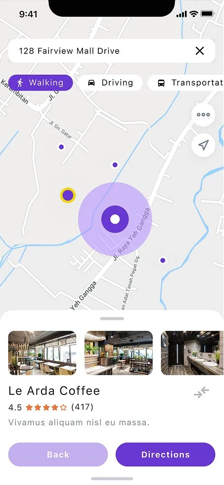
Rita
Rita taps on “Le Arda Coffee,” one of the nearby options. Without leaving the map, she sees a preview card with key info: ratings, walk time, open status, and real photos of the space.
She swipes through images to confirm the seating and ambiance. The tags reassure her that Wi-Fi and outlets are available, along with clean restrooms. She’s almost ready to go.
Rita
Before heading out, Rita clicks on the Compare tab. She reviews “Happy Coffee” side-by-side with “Le Arda Coffee.” The comparison makes it clear: fewer tables, closes earlier, and lacks comfy seating.
She confidently decides to stick with her original choice.

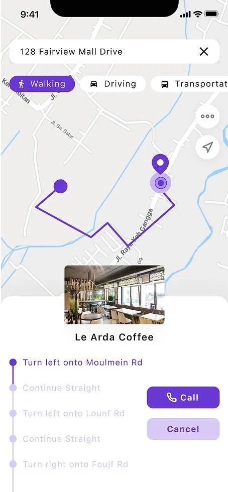
Rita
Rita hits “Directions” and receives walking instructions. The clean interface guides her through each turn.
If she’s uncertain about seating, she uses the Call button to reach the café directly and confirm availability — no third-party app is needed.
Future Steps
Although this 5-day sprint allowed me to validate a core solution direction, there’s still plenty of room for growth and refinement—especially as PostUp transitions from concept to a real-world product.
More location coverage & contextual research
To ensure broader usability, I’d love to explore how users in suburban or international regions navigate their workday—and whether they face different friction points, such as cultural norms around staying in public venues or access to clean facilities.
Deeper testing across usage contexts
If time allowed, I’d conduct moderated usability tests across more user contexts—like rush hour searches, evening planning, or rainy-day decisions—to further stress-test layout clarity and navigation responsiveness.
Social features & community layer
Many interviewees mentioned sharing good spots with friends or coworkers. In a future phase, I’d love to experiment with light social features—such as posting reviews, sharing favorites, or co-working availability—to build trust through community insight, not just platform verification.
Optimize cross-platform experience
The design is mobile-first, but users may plan on desktop and execute on mobile. An adaptive layout would unify discovery, saving, and filtering across devices, ensuring PostUp stays useful for planning or browsing on the go.
Next Project

The Superhairpieces Booking System is a scheduling platform designed for both B2C and B2B scenarios, supporting online bookings and in-store staff scheduling to enhance service efficiency and user experience.